Brand Design for Friendly Pantry
It’s no secret that connecting with and designing effective visual brands for other entrepreneur moms really lights me up, and working with Corinna was no exception! She is the founder of Friendly Pantry, a business that is passionate about “making kitchen pantries friendly after food allergy diagnosis.” In addition to being the first Canadian-based certified AllerCoach (yup, that’s a real thing!), she’s also a mom of two with many years of personal experience successfully navigating the food allergy world. She provides education, support, and a thriving Facebook community to reduce the frustration, confusion, and anxiety that can overwhelm parents of children who have food allergies. She also works with businesses and organizations to make them allergy friendly. Here's a look at our full process.
1 | Brand Discovery — Summary & Springboard
An effective, noteworthy brand always starts with being INTENTIONAL — representing the heart of each business in a way that attracts the ideal clients. It's not enough in today's competitive marketplace to just "look pretty.” Specific words and feelings are imperative to a strong foundation. I provide consultation, a questionnaire, and a Descriptive Word Bank to help clients define their business and their market.
I always create two critical pieces in the Discovery phase: a Brand Summary and Brand Springboard. The Brand Summary contains words and color psychology that are specific to my client’s business. This also becomes a future reference tool as clients write for and choose images for their brand long after we’ve finished the design process. The Brand Springboard (also known as an inspiration board or mood board) is a visual representation of the brand, full of imagery, type styles, and colors. I prefer the term "springboard" because it truly is a critical jumping-off point that sets the tone for all the parts of the developing brand. Every piece finds its roots in these beginnings.
As we explored Corinna's brand over lattes (because — bonus — we live in the same city!), we discovered that the three keywords that describe her brand best are trusted, friendly, and relatable. There can be a lot of negative emotions that surround allergy diagnosis, and her goal is to approach this from a positive perspective, empowering her clients and community. I then expand these keywords into other descriptors and feelings and choose colors that complement the keywords. Here we use turquoise (for security, healing, and balance) and orange (for optimism, energy, and confidence). As you can see, they perfectly align with with her hope-filled, encouraging business. With this insight, I then create her Brand Summary and Springboard. These go through a couple of revisions to ensure we are both on the same page and jazzed about the direction we're going.

2 | Logo
With her Brand Summary and Springboard approved, I dig into designing her logo. There's lots of sketching and pencil-to-paper that happens behind the scenes, always keeping the Discovery words and visuals front and center. It's so important to get ideas on paper before jumping on the computer. Ideas flow quicker, and I can explore lots of options in a more intuitive way without getting bogged down and wasting time on details — yet. The details come later!
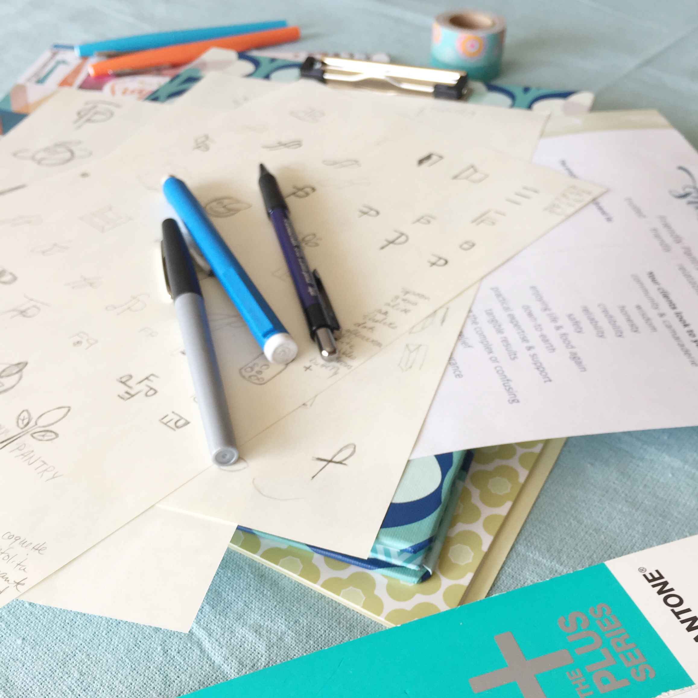
Several pages of sketches and ideas then get refined digitally for the client to see. The first round is presented in black and white so that the focus is on the integrity and effectiveness of the design, not the individual colors. It's so easy to get bogged down in color selection while neglecting the basic structure and message of the logo itself.

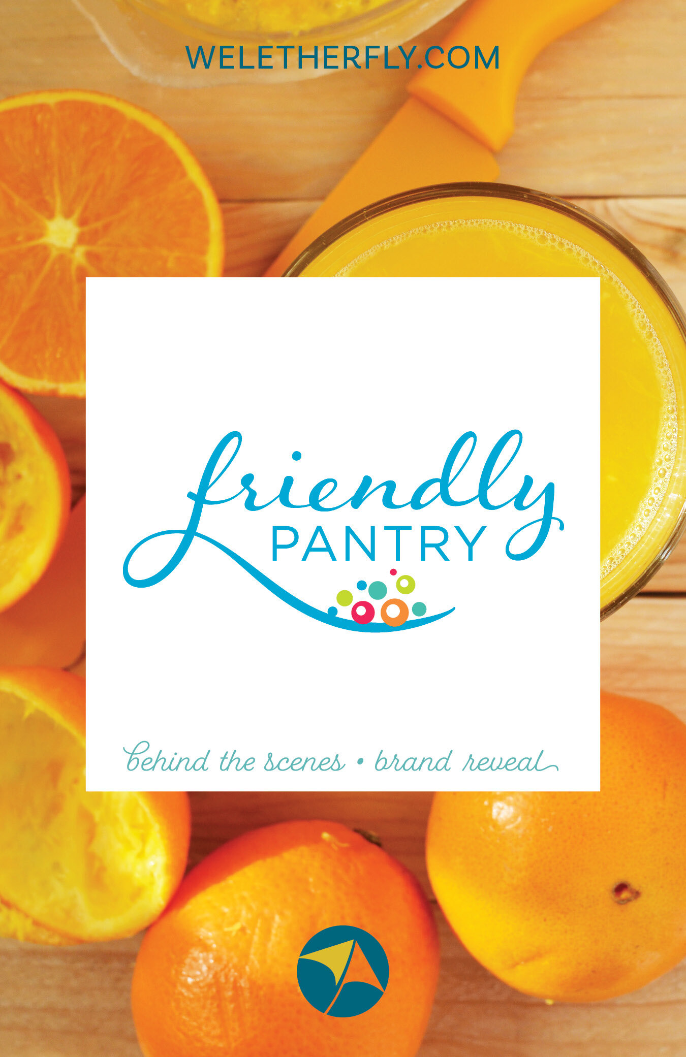
The symbolism in the tail of the “f” hints at a spoon (for serving or eating) without being too literal, and communicates food, nurturing, and community. Because her audience is primarily moms, we kept a slightly feminine feel, without being overly sweet. The logo gets lots of tweaking, adjusting, and polishing until it’s all just right. Can you tell the difference between the first proof above and the final version below? Alternate logo formats, colors, and the favicon quickly follow.

3 | Brand Board
Her final Brand Board pulls together all her branding elements in one handy location. My goal is to make using new branding as easy as possible for my clients, so having everything in one place is a must. Clients also receive a Brand Style Guide — a pdf that outlines the “do’s” and “dont’s” of how to implement their branding, consistently and simply. Having all these pieces in place, Corinna was able to build her own website using Squarespace.

4 | Collateral pieces
A new Facebook banner for her community group, information postcards highlighting her services for doctors’ and dietitians’ offices, and business cards were also part of the design process.

Corinna is a warm, smart lady who is making a difference for parents navigating food allergies. My youngest daughter and I have Celiac disease (not an allergy, but still a chronic food issue that affects our everyday lives) so I am a member of her Facebook community, and I have witnessed firsthand how positive, uplifting, and informative it is. If you or someone you know is dealing with food allergies, be sure to check out her community here or learn more on her website.

Even though the cost of hiring a designer made me hesitate, I took the leap because I was overwhelmed with doing it myself and I wanted a brand that I would be proud to call my own. After working with Michelle, I’m confident to show off my company because all of my "stuff" looks great and has a consistency that I love!
— Corinna Meckelborg, Friendly Pantry