Brand & Website Design for Literacy Partners
Dahlia Dallal is the founding director of Literacy Partners, a boutique educational consulting firm in Los Angeles. She’s passionate about creating vibrant, successful schools and classrooms full of learning and laughter. She and her team work side-by-side with educators who encourage students to love reading and writing through custom, innovative workshops.
Dahlia came to me through my friend and colleague Jennifer Rappo. JR is a gifted Leadership Development Coach who helps those with an important message step up and live their legacy now. Her work with Dahlia was all about upleveling her already-successful business and giving her the confidence to boldly share her mission and message. LP was already making a big impact in education. With her rebrand and so much behind-the-scenes work with JR, Dahlia has now positioned LP as a true leader in the industry.
One look at Dahlia’s outdated logo and JR knew a rebrand would be integral to completing this transformation. As an expert collaborator, it was no surprise when she brought together an incredible team of creatives. I had the joy of working with one of my favorite copywriters Jacqueline Fisch and website genius Dani Shaw. Dani patiently endured my repeated question “can you do this for her website?” and answered “yes” every single time. I finally clued in and quit asking; she could literally do anything. We also had new, branded photography from Cynthia Spivack which made all the difference in the final product.
We launched the rebrand and website for Literacy Partners in early 2020. Before COVID-19, all LP workshops were done in person, though Dahlia had considered conducting some of her workshops online so she could make a bigger impact in schools outside greater Los Angeles. With the current closure of group meetings and her new brand in place, she was positioned to reach more schools virtually and bring together experts in a way she never has before. While other professional development companies are closing their doors, she’s expanding and serving her clients in new, relevant ways. It’s so exciting to see her grow!
1 | Brand Strategy
Dahlia has devoted her career to teaching, so it’s easy for her to talk about her business, her schools, and her passion. She’s heartbroken when she sees discouraged teachers and underperforming students and almost vibrates with energy when they finally “get it.” Her approach is a true partnership with administrators, teachers, and students, and when they succeed—she succeeds. While creating her Brand Strategy, I repeatedly choked up as I read her words; her joy and enthusiasm are contagious.
When I presented her Brand Strategy over Zoom (I was doing this long before it became the norm), she stood up shortly into the presentation and reached across her desk. I was confused until she told me she had to get a tissue because she was crying. She never saw her company’s vision condensed into such an accurate, clear picture. When happy tears are shed, it’s a sure sign we’re on the right path!
Our keywords for LP are inspiring, visionary, and joyful. Schools feed off her enthusiasm and start to remember why they became teachers in the first place. Students begin to enjoy reading and writing, some for the first time. Test scores go up and the hallways start buzzing with energy and excitement. This energy had to come through in her new brand.
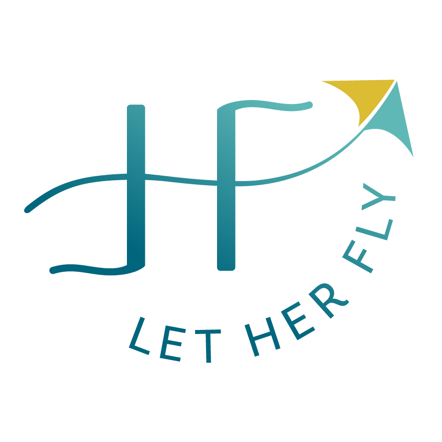
2 | Logo Design
With this clear Strategy in place, creating a logo to stand out in the literacy support industry would be easy. Most of Dahlia’s competitors have logos featuring childish crayon drawings or pencil and book icons, much like her previous logo. Our goal was to create a professional brand and appeal to school administrators whose goal is to become the go-to school in their district.
The new icon is symbolic in multiple ways. The interlocking shapes emphasize the key partnership between LP, administrators, teachers, and students. The shapes also represent books on a shelf with the overall jewel shape showing the quality and excellence of their programs. We kept the font clean and legible with careful attention to spacing and the tiniest customizations; it is a literacy company, after all!
3 | Brand Board
The logo and additional pieces come together in the Brand Board with additional marks, fonts, pattern, and of course custom photography.
4 | Collateral, Marketing, & Social Media
Dahlia continues to be an ongoing client as we’re always creating new marketing materials. Some of our pieces include flyers and registration forms, a slide show and display for industry trade shows, and social media banners and templates her team can easily edit. She has proudly affixed her logo to her office door!
5 | Website
Dani did an incredible job uniting Jacq’s copywriting and my visual branding into a clean, engaging website. It's much more effective and organized than Dahlia’s previous site. Not only does it look amazing, but it’s easy to navigate and fully integrate with Eventbrite and her CRM.
This rebrand is a great example of my Signature Plus+ Brand Package which includes all the elements you need to take your brand to the next level, just like Dahlia did.

“When Michelle presented the first brand strategy, I cried tears of joy! I felt like she deeply understood the vision and purpose of my company and captured it into just the right colors, images, and words.
She always explains her design decisions when I'm unsure and helps me see the big picture. Having a professional brand has positioned Literacy Partners as a leader in our industry so we can make an even greater impact in education—my ultimate goal.
She’s super easy to work with—always responsive and professional. Thanks for everything, Michelle! I really love working with you and am grateful for our ongoing partnership!”
– Dahlia Dallal, Founding Director, Literacy Partners


Return to Portfolio