Don't Make This Mistake With Your Brand (or Your Life)
I see you doing so many great things with your branding!
You’re doing the hard work of putting yourself out there to reach new clients.
You’re actively engaging on social media.
You’ve got a gorgeous color palette.
You’ve chosen fonts that are classy and easy to read.
But all of this will still leave your audience confused if you’re missing this overarching, important piece. And it’s so easy to fix.
Believe it or not, this same missing piece may be causing confusion and frustration in your personal life too.
Keep reading to make sure this isn’t happening to you.

If you’re like most entrepreneurs, you spend a fair bit of time creating your own graphics. It’s not feasible to outsource every single social media or blog post graphic, and you’re probably updating web pages, workshop handouts, or sales sheets too.
You may have a tendency to add more and more stuff into your graphics and pages, trying to fix what’s bugging you, wondering why it’s not coming together. Your solution may be as simple as this one often-overlooked principle.
Your design must have hierarchy.
Hierarchy in branding refers to a visual order of importance, and it’s your job to lead your viewer from the most important elements to the least important, and remove the things that aren’t important at all. Your design needs one primary focal point, along with secondary focuses, plus sometimes less important but still necessary info. If everything looks the same or there’s so much clutter to wade through, then your viewers are confused and overwhelmed. Having this clarity in your printed and digital material will help you stand out, and it holds true whether it’s a single object like a logo or social post or a full-page design like a trade show flyer or web page.
Ask yourself: What should your client see, read, or feel first? Then how can you arrange things (or outright eliminate things) to make that happen?
Here are some tips to help establish hierarchy.
Hierarchy through FLOW
In our culture, our eyes generally flow from top left to bottom right so it’s often best to use this to your advantage. That means your design should flow in a pattern like one of these:

You don’t want your viewer’s eyes to bounce all over the page or work from the bottom up. It’s confusing, unnatural, and tiring and can cause them to entirely miss what you are working so hard to communicate.
Hierarchy through the use of individual, or groups of, ELEMENTS:
There are many qualities that naturally attract our eyes, so use these to your advantage. Here are some ways we design elements to create (or to minimize) focus.
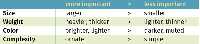
This simple list also provides lots of interesting combinations to help achieve the most focus. Some ways to give emphasis are:
A word or phrase that is large, in a thin weight and bright color;
A word or phrase that is small but bold or heavy in a light color;
All words of a group in the same size and weight, with one or two words or a simple headline in a brighter color than the others;
A photo or graphic in bright, airy colors.
Here's a simple trick to help you figure out what’s dominant in your design. If you usually work digitally as I do, print the design off, preferably in color, and turn the page upside down. Look at it quickly. Where does your eye go first? Is this where you want the focus to be? Looking at it upside down removes the prejudgments we have due to natural language and repetition, those same things that allow us to read a paragraph over and over and never see the glaring spelling error! It keeps us from naturally filling in the blanks and jumping to conclusions. It’s a way to look with “fresh eyes” and see what you might have missed before.
So for each design, consider what your client ought to see first. It may be your logo, a catchy headline, a question that speaks to their dreams or pain points, or your web address. What will catch her attention? Then shape that through one of the above methods.
So what does this mean in our personal lives?
In the same way that our branding benefits from a clear hierarchy, so do our personal lives. Without focus, we lack the clarity to know how we want to spend our time and energy. While intention is all about making deliberate choices, our most satisfying choices (even the hard ones!) will always align with what we deem most important.
So here are some questions to think about:
What is the hierarchy in your life in this current season? What are the 3 most important things to you?
Are you spending the bulk of your time on what you truly believe to be most important?
If necessary, what adjustments can you make to bring these two things in line?
As I’m writing this, we are in summer break season. My kids are out of school, we’re in the middle of a messy kitchen renovation (because who wants to do that in the dead of winter?!), and we have some family vacation time in July and August. So what’s important to me in this season is very different than it was one month ago or will be one month from now. I’m taking breaks, spending time with my kids, working on projects around the house, putting less pressure on myself to get more work done, and generally focusing on very different things than I am during the rest of the year. And as much as I have to silence the “you should” voice in my ear, it’s freeing to know that my choices are the best ones for this season.
Remember there is so much grace for each of us! Keeping priorities in line and focusing on what is really important is an ongoing battle. We are pulled in so many directions. We have such limited time. So extend grace to yourself. Make tweaks and adjustments so you can live in alignment with your deepest priorities and be who you truly desire to be, in your business and your relationships. It will be worth it!
I’d love to hear how you're focusing on what’s important in your life today!