Don’t Make This Mistake on Facebook
Welcome to Tip Tuesday!
In any given week, I answer lots of design-related questions from clients and Facebook group members and realized that these answers would be helpful for many of you too. They’re all super simple things you can do right now, with absolutely no art degree required. Promise.
Think of them as quick and easy design/branding tips and tricks so that you can look a little more professional and a little less DIY. Sound good?
Today I'm sharing an easy hack for Facebook — use the CORRECT dimensions for your banner images.
I know. A quick Google search told you to make it 851 x 315 pixels, and, being the good student that you are, that’s exactly what you did. So it’s not your fault. But please DON’T make it this size!
Instead, build your banner graphic to the dimensions of 851 x 480 px.
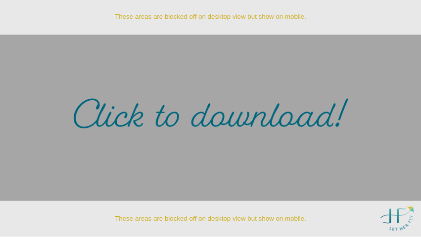
Watch the quick video below for the reason why, how to build it in Canva, and a super helpful template you can download as a guideline.
Here’s how my Facebook banner looks on a desktop computer. Seems fine, right?
But look how the view changes on a mobile (or iPad) device...
Here’s my Facebook banner on mobile, built to the WRONG (though Google-approved) dimensions. See how the text and CTA are cropped off on the right?
Here’s my Facebook banner on mobile, built to 851 x 480 px. Notice that there’s more image at the top and bottom, but all the text is visible. Much better!
Take a look at your Facebook business page on your computer and then on your phone. Is anything cropped off that shouldn’t be? Make this quick adjustment so no one misses your important info.
Click the template image below and download it to your desktop. Then upload it into Canva or whatever design software you use for an easy, no-brainer guide.
Need more help with Canva! Don’t forget you can also access my trio of tutorials on YouTube here.
Have more questions? Ask away. Chances are if you’re asking, so is someone else. I’d love to answer them in a future blog post.


