The Space Between (aka Leading)
Welcome to Tip Tuesday!
It’s time for another quick design tip to help you look a little more professional and a little less DIY.
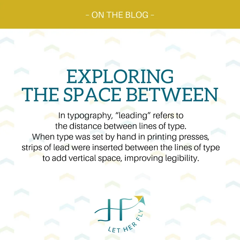
This week I’m sharing some advice about LEADING – a technical term for what’s commonly called line spacing or line height. (If you want the brief history lesson on the origins of this quirky term, you’ll have to watch the video.)
Here’s what you need to know.
Within each block of text, you want the space between your lines to be comfortable and legible, not too cramped together and not so spread out that it’s bumping into the things around it.
Once you have the leading right, then you’ll also want to consider the space around each block of text.
Is the headline connected to the body text?
Is there breathing room around the text?
Does it have it’s own “personal space” without bumping into everyone else at the party?
Can you easily scan and find the info on the page that you need?
Watch the video for a quick how-to (and that history lesson you may or may not want).
Here’s the “before and after” example.
BEFORE: This is how the text looked when I typed it into Canva. See how the page looks crowded with so much copy? Every element from the top to the bottom is running into each other, making it uninteresting to read.
AFTER: The ONLY change I made was to reduce the leading (Canva -> Spacing -> Line Height) in the headline and body and reposition them to the center. See how the space opens up and it feels less crowded?
So before you spend time cutting copy or rewriting your headline, try this first. It might be the easiest, quickest, and most professional looking solution.
What other questions do you have? I’m happy to answer them in the next letter!


