Brand Design for Kimberly Knull
It's time for another brand reveal!
This brand was designed for Kimberly Knull, a Registered Psychologist, former educator, and a Certified Facilitator in Brené Brown's Dare to Lead™ and Daring Way™ programs. This powerful combination of expertise means Kim's an expert in helping others create the life and business they want, through courage and vulnerability.
Join me behind the scenes for this latest reveal...
1 | Brand Strategy
Like her clients, Kim spent many years hiding her pain and dissatisfaction behind a perfect façade and impossible expectations. As a therapist and proponent of Brené Brown's methodology, she knows how much joy and satisfaction are possible when we do the scary, hard work of figuring out what's important to us and chase after those desires. This led us to our big idea of "Chasing Courage," allowing us to shift from her previous business name, Courageous Leadership, to her personal name while still keeping the essence of what Kim's all about.
Our strategy keywords are courageous, wise, and ease. The color psychology of slate is integrity and intelligent, pool is serene and spacious, and goldenrod is grounded and supportive. Her colors were pulled from existing brand photography that beautifully expressed the calm, reassuring mood of her brand which supports her clients on their path to creating a more joyful, peaceful life.
Moodboard images: quote | journal | Deniz Altug painting | all others Unsplash
2 | Logo Design
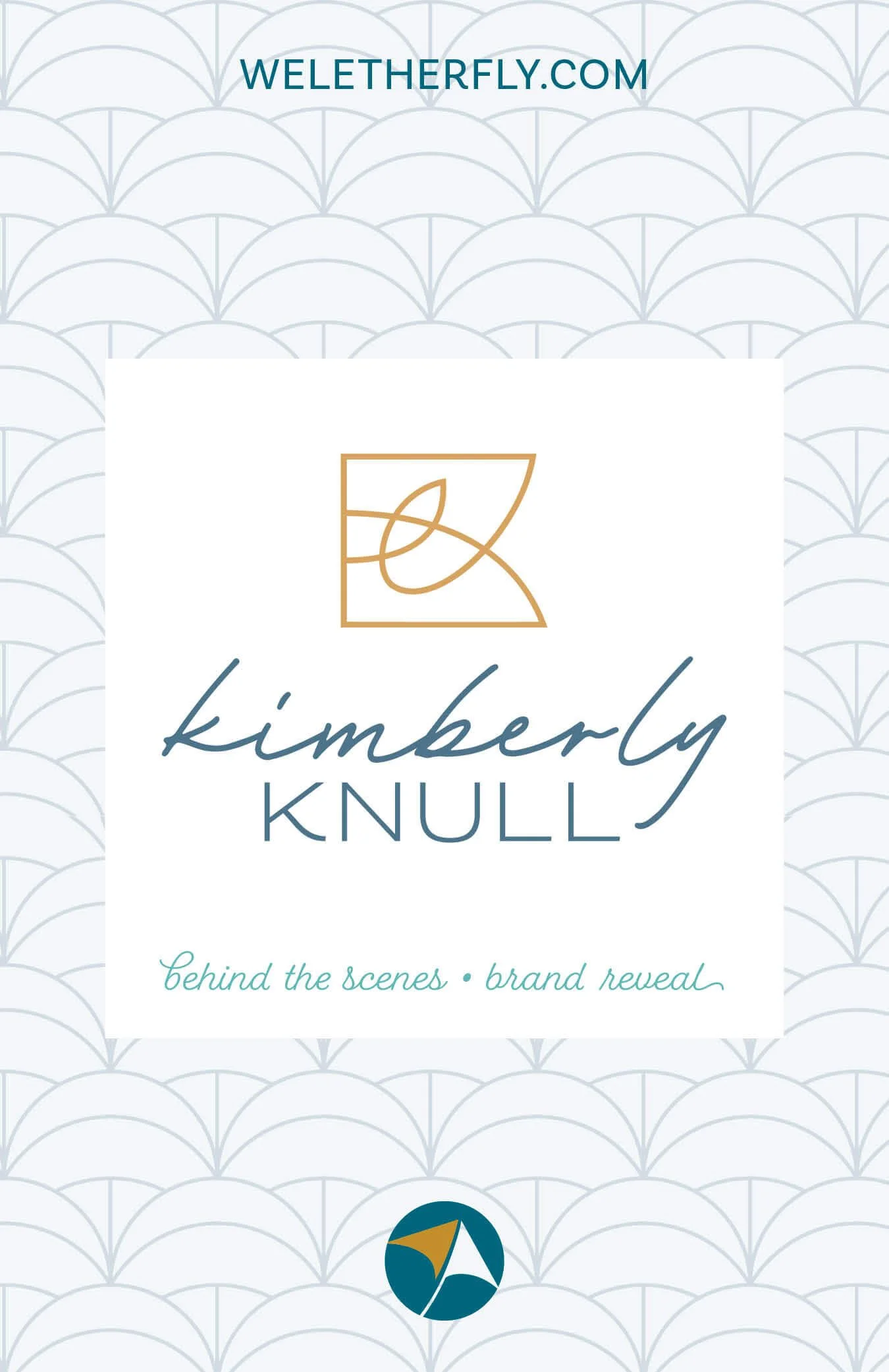
Because Kim has same first and last initials, I wanted to incorporate this into her icon but also didn't want it to feel harsh from all the angles of the letters. Her icon integrates not only her initials but also a stylized segment of the Dara Knot, a Celtic symbol of strength and wisdom. This is a much more personal representation of Kim's Irish heritage than the African symbol used in her old logo. The curves of the icon, script font, and subtle arches in her last name all help to soften the entire logo, giving it a calm, fluid feeling.
3 | Brand Board
In addition to her primary stacked logo, I also created a horizontal logo to fit more easily into small spaces like social media posts. Her icon can also be used as a stand-alone watermark, and the pattern has the same simplicity as the icon for additional variety in the brand. Clearly specifying her new brand colors in Pantone, CMYK, RGB, and HEX formulas ensures consistency across digital and print media.
4 | Collateral
Kim and her team were wasting too much time trying different colors and configurations every time she sent a newsletter. By designing a new template right inside Squarespace, with masthead and custom sections, she can now share content more regularly, with less friction.
During our process, Kim also decided she wanted to keep "Courageous Leadership" as the name for all her speaking and workshops while "Kimberly Knull" would be the primary logo and overall brand for her therapy work. A new sublogo in the same style allows all the pieces to work together as a unified package.
She also launched a new podcast called "Therapy Explained" where she goes behind the scenes of what therapy is and isn't, so it feels more accessible to everyone. Designing new cover and episode artwork was an important part of her package so she could get this new project off the ground more easily. Banners were also designed for her YouTube channel and Facebook group where she shares her podcast content.
5 | Social Media
As always, her package includes new social banners and templates so she can publish helpful articles and quotes and promote her upcoming workshops. Her files were designed in Canva and in Adobe to make things easy for her team to update and publish.
5 | Website
By bringing together her own photography, stock photos, and patterns, I also designed banner artwork for her website which is still being updated. Having a detailed Brand Style Guide and organized assets is enabling Kim's team to create additional marketing materials and overhaul her entire website.
Kim's new brand is a beautiful example of my Signature PLUS+ Brand Package where we also enlisted website copywriting by Jacq Fisch. You can follow Kim on LinkedIn and Instagram, or check out her podcast and upcoming workshops.
How does Kim feel about the final result?
“When I reached out to Michelle, I was ready for a non-nonsense professional who would deliver what she promised.
My new brand is cohesive, beautiful, and more professional. Her process was very easy, and she even connected me with other experts in her network who are supporting additional aspects of my business.”
– Kimberly Knull, Registered Psychologist and Certified Dare to Lead™ and Daring Way™ Facilitator
How about you?
If you’re ready to look more professional, book a free call and let’s chat.


