Pantone Color Trends—the Right Way
Do you ever wonder how to choose the right colors for your brand?
Ever wonder if those “trendy” colors are right for you and, if so, how to use them?
If these thoughts have ever crossed your mind, if you’ve ever thought of ditching your current color scheme because a new one is literally making you swoon, then you’re in the right place today. Here are my best tips for choosing the right colors—yes, even the trendy ones.
First, some techy background…

Pantone Color Institute is an international body that, among other things, forecasts the “in” colors for the upcoming season or year, most notably in the areas of fashion design, interior design, and graphic design. They’re the reason why you start seeing all the trendy colors come out. This is never an accident; it’s carefully planned about a year in advance. Because of my profession, these trends are always on my radar.
For graphic design, Pantone announces one “Color of the Year,” usually in early December. Some years, this color quickly becomes nauseatingly overused. All you have to do is look back to 2016 and the overuse of Rose Quartz. You couldn’t get away from it if you tried. It was as if every blogger and solopreneur said, “Hey, Pantone said it was cool, so let’s use it eeeeeeverywhere!” Barf.
For 2019, Pantone’s Color of the Year was Living Coral. As a designer, knowing this is interesting but honestly doesn’t have much bearing on my creative decisions. We always set our client’s brand strategy first and then choose the best supporting colors. However, coral turned out to be the perfect color for not one but TWO of my clients because it had the exact color psychology we needed.

Coral is a combination of red and orange, so it brings together all the warmth, energy, and passion of those colors with a bit of a fresh twist. Some of the keywords for coral are:
vitality, lively, exotic, cheerful, optimistic, playful, active
As I mentioned, this became the key color for two clients. I’d say it was unintentional, but that’s not entirely true. It was unintentional in the sense that we did NOT start with this color and decide that’s what we wanted to use and then build the rest of the brand around our color choice. I didn’t start the year saying, “Gee, I’d really like to work this color into my client projects this year.” That would NEVER happen!
It was very intentional from the perspective that we thoughtfully set the strategy and keywords, and I quickly realized that coral would work beautifully for the messages we wanted to convey.
What I want you to notice through the examples below is how one color, taken in context with the rest of the color palette and imagery, can be used to represent two very different businesses.
The first example is one you’ve heard me talk about lately—Tribal Vanilla. They are a product-based business that sells fair-trade vanilla beans.
The second business is Fresh Mama Sleep Solutions, a service-based pediatric sleep consultancy that helps babies and toddlers sleep better so mom can sleep better too.
Take a look at their inspiration boards:

Tribal Vanilla Keywords:
dynamic, global, personal

Fresh Mama Keywords:
exuberant, refreshed, hopeful
You’ll notice the Tribal Vanilla board is more intense and dark. That’s because their brand is bold and adventurous. Being product-based, we also want to ensure that it will stand out on a store shelf. Look at the color bar and you’ll see coral is used as a supporting color, not the main color.
Fresh Mama uses the exact same coral, but we dialed it back ever so slightly and balanced it with softer complementary colors to get an entirely different feel and mood. Their brand is supportive and nurturing, while still being fun and youthful. Here, coral is the primary brand color.
It’s easy to see 2 things when we look at these side by side:
A “trendy” color can be used in a totally unique, completely customized way.
The same color can be effectively used for two entirely different businesses.
So how can you use these examples to choose the right colors for YOU?
In a nutshell, start with the brand strategy. (Are you seeing my pattern lately?)
What are your keywords and your big idea?
What are your core values and purpose?
How do you want your clients to feel as they engage with your brand?
Name them as specifically as you can.
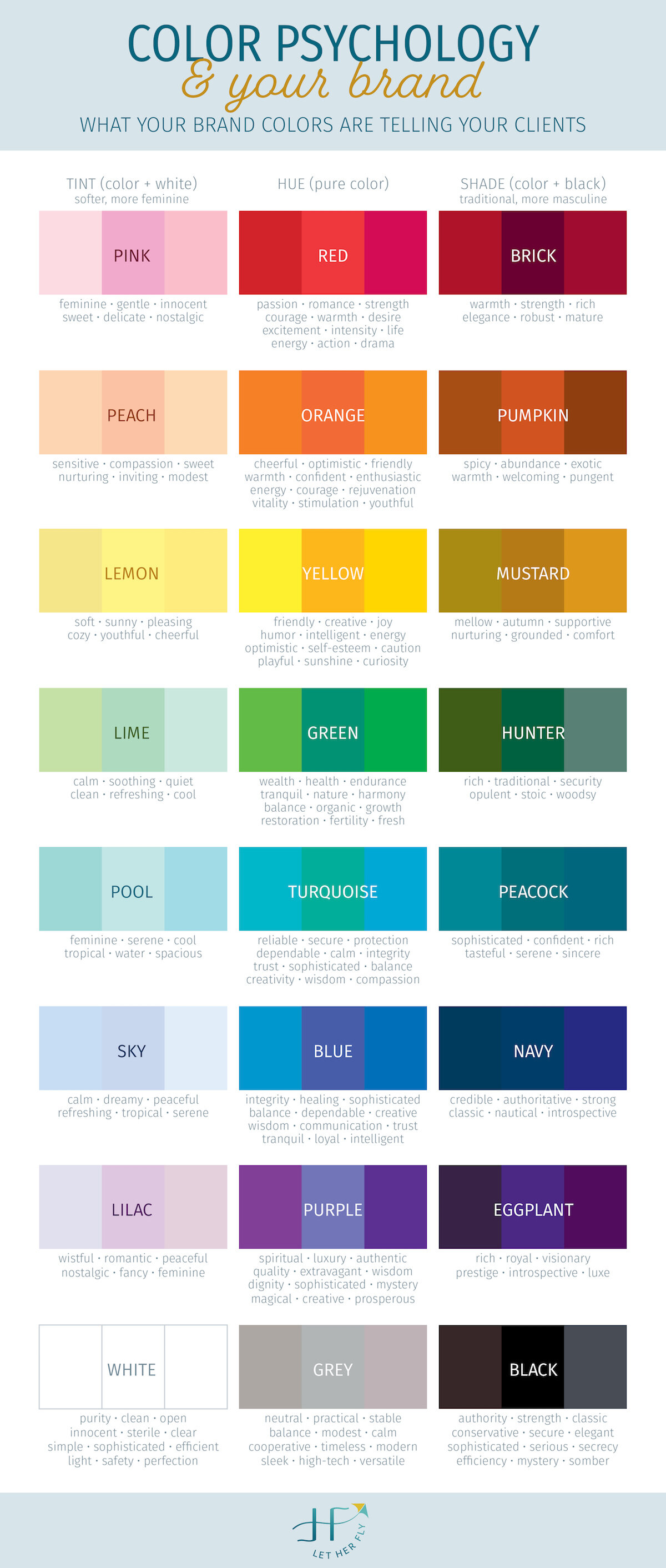
Once that language is clarified, follow the breadcrumbs to discover the other elements of your brand, including color. Compare the words and ideas you want to communicate with a Color Psychology Chart. You can download mine by clicking on the graphic to the right and read more specific “how-to” examples here.
Never blindly follow the trends. They’ll always be “here today and gone tomorrow” so when tomorrow comes around, you’re instantly left holding something outdated. Approaching color strategically helps you avoid that disappointment.
Ask yourself if that color you love so much would work for your business even if it weren’t trendy. If your answer is “yes” then it’s probably a solid, strategic choice. This gives you longevity and authenticity—2 major advantages for your brand. If you’re not sure, instead of feeling like you have to change colors again (boy, that can be exhausting and expensive), admire and enjoy what’s out there without having to try it on for yourself.
You’ll have such a sense of freedom when you can take the pressure off yourself to “keep up.” There’s no “keeping up” in branding. It’s all about doing what’s best for you and your business.
In other news…
I’m so excited to tell you that the website has been updated with new branded photography (bye-bye, stock photos!). My Services page has also been updated to finally reflect the actual packages I’ve been providing to so many amazing women this year!
So much has pivoted over 2019 and it was time to put some of the same love and attention that I pour into my clients into my own brand. I hope you love it as much as I do!
I’m eager to share everything I’ve learned this year about brand photography (through both my own shoot and my clients’—highs and lows included) without sounding like a hot mess and completely overwhelming you. There are so many nuggets of wisdom that you NEED to know if you’re planning your own shoot. As soon as I sort that out, you’ll be the first to know.
And if you’ve been thinking it’s time for you to uplevel too, there’s just enough time for one of you to hop on my calendar and be fully rebranded before the holidays, totally lookin’ like the pro you are. Book a consult below and let’s chat!
And one last thing…
I have an exciting giveaway contest happening in a few weeks that will only be open to my mailing list. So if you’re not on it, what are you doing??? Sign up in the footer below. It’s too soon to share the details, but keep watching your inbox. If you’re starting, building, or growing a business, you won’t want to miss this chance.