Brand Design for Everyday Effectiveness
Many entrepreneurs are so overwhelmed by the day-to-day operations of their business, they never experience the benefits (and there are many!) associated with self-employment. If this is you, you'll want to pay special attention to this week's brand reveal.
Gwen Bortner is an Operations Strategist who believes support makes a huge difference between what you do and what you wish you did. At Everyday Effectiveness, she helps women define and stay accountable to the right goals—ones that work for them, not someone else—so they can get out of overwhelm and enjoy their entrepreneurial journey.
Hop in for a fun, little road trip behind the scenes of this week's reveal!

1 | Brand Strategy
As an Operations Strategist, Gwen's specialty is helping women create a business roadmap as unique as they are. Once they know where they're headed, they then map out specific goals to get there, while avoiding common pitfalls along the way.
Her 30+ years of experience give her the perfect blend of big-picture business strategy and nitty-gritty operations management. Her sweet spot is helping women entrepreneurs who've already had lots of success get past their current plateau and on to their next level of growth.
With this in mind, our strategy keywords are clarity, grounded, and perceptive. The color psychology of leaf green is rooted and balanced, peacock is sincere and dependable, and marigold is optimistic and confident. The summery color palette makes you want to hit the road with the sunroof open and tunes cranked!

Moodboard images: path | pattern | illustration | all others
2 | Logo Design
The double "e" of the business name is the focal point of Gwen's logo mark. We wanted to keep the road trip vibes and the feeling of forward, upward momentum while also keeping some of the roundness of her previous brand. Gwen's former brand felt too "corporate" for her current heart-centered clients. Think of the mark as a two-lane highway, cruising through the mountains. Using a narrower, softer font allows the long business name to take up less real estate while staying legible.

3 | Brand Board
Because her logo is very horizontal, I also created a round format to use in compact spaces, as well as the usual button for favicon and social applications. Her wavy pattern continues the theme of forward motion and highway road trips.
I also created a fun set of icons that are lighter and more fluid than her previous ones to use on her website and different services.

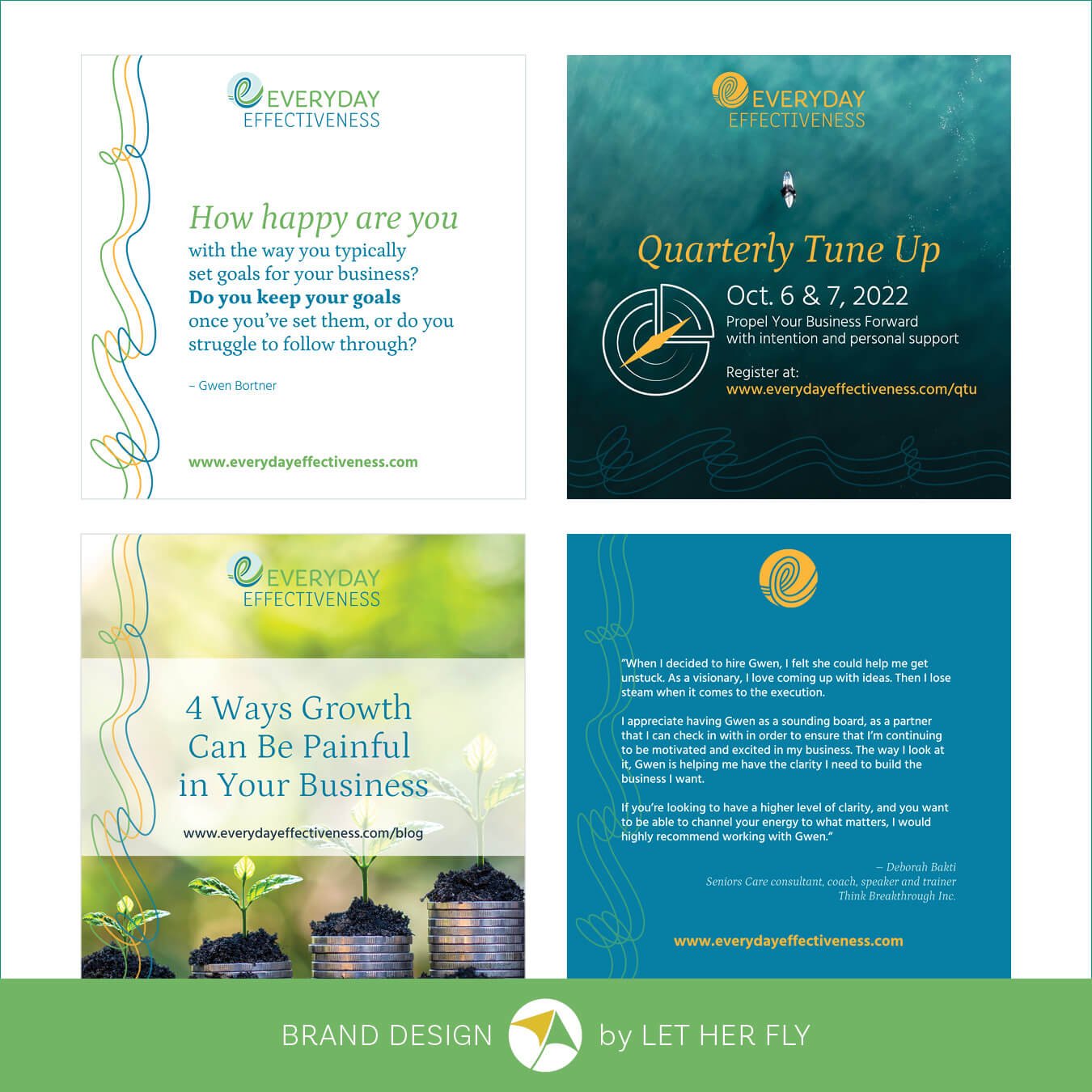
4 | Collateral & Social Media
Having a variety of branded elements give us lots of options for creating her social banners and templates. Everything's in Canva for her team to easily update and publish.


5 | Website
Gwen's detailed Brand Style Guide and organized assets is enabling her team to create additional marketing materials and design a new website while staying completely on brand.
Everyday Effectiveness is a great example of my Signature Brand Package which includes all the elements you need to update your brand image, just like Gwen did.

How about you?
If you need to update your brand so you can attract more perfect-fit clients, book a free call and let’s chat!